Create interactive Candlestick charts of OHLCV data obtained from yfinance library using python libraries.
Visualization
Finance
Published
January 26, 2024
This post was written primarily because I wanted to learn how quarto’s computations work along with interactivity of Bokeh and Plotly in python, also found out that as of now we cannot contorl the size of output images produced with matplotlib (hence them appearing large in this post).
Introduction
In this post, we will be looking at creating candlestick charts, which are integral to traders’ daily routines, using Python libraries such as Mplfinance, Plotly and Bokeh, and look at customizing the plots, change themes and tweak some colors.
As this post is written on Quarto, it enables viewers to interact with the output plots. You’ll be able to pan and zoom with the charts created with plotly and bokeh!
So, now lets head on to fetch our data first.
Getting Data
We will make use of the yfinance library. Let’s fetch the Open-High-Low-Close and Volume data for Apple (AAPL) for the past 5 months.
Our data looks like this:
Code
import warningswarnings.simplefilter(action='ignore', category=FutureWarning)import yfinance as yfimport pandas as pddata = yf.download("AAPL", period="5mo",auto_adjust=True)data.head()
[*********************100%%**********************] 1 of 1 completed
Open
High
Low
Close
Volume
Date
2024-02-06
186.369081
188.812642
186.279321
188.802673
43490800
2024-02-07
190.139164
190.548090
188.114498
188.912399
53439000
2024-02-08
188.892437
189.042037
186.857803
187.825256
40962000
2024-02-09
188.394466
189.732663
187.745353
188.594208
45155200
2024-02-12
188.164784
188.414445
186.536987
186.896500
41781900
Plots
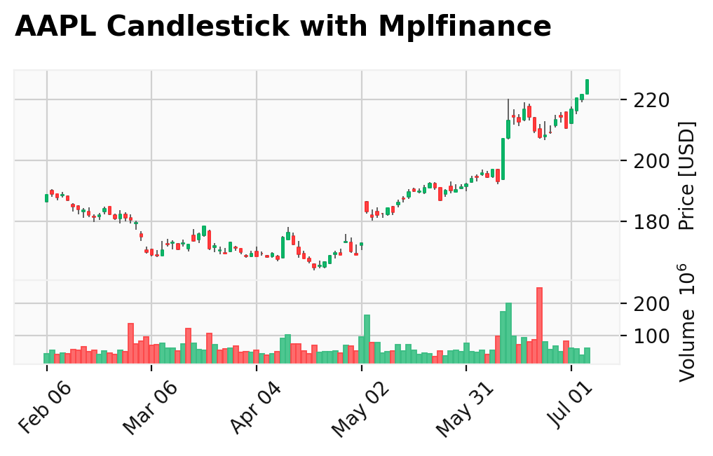
Now we will head straight into plotting. We will start with mplfinance, a special module for finance charts of matplotlib.
mplfinance
Creating candlestick charts with mplfinance is a simple one line code:
Code
import mplfinance as mpfmpf.plot(data, type="candle", volume=True, style="yahoo", figsize=(6,3),title="AAPL Candlestick with Mplfinance", ylabel="Price [USD]")
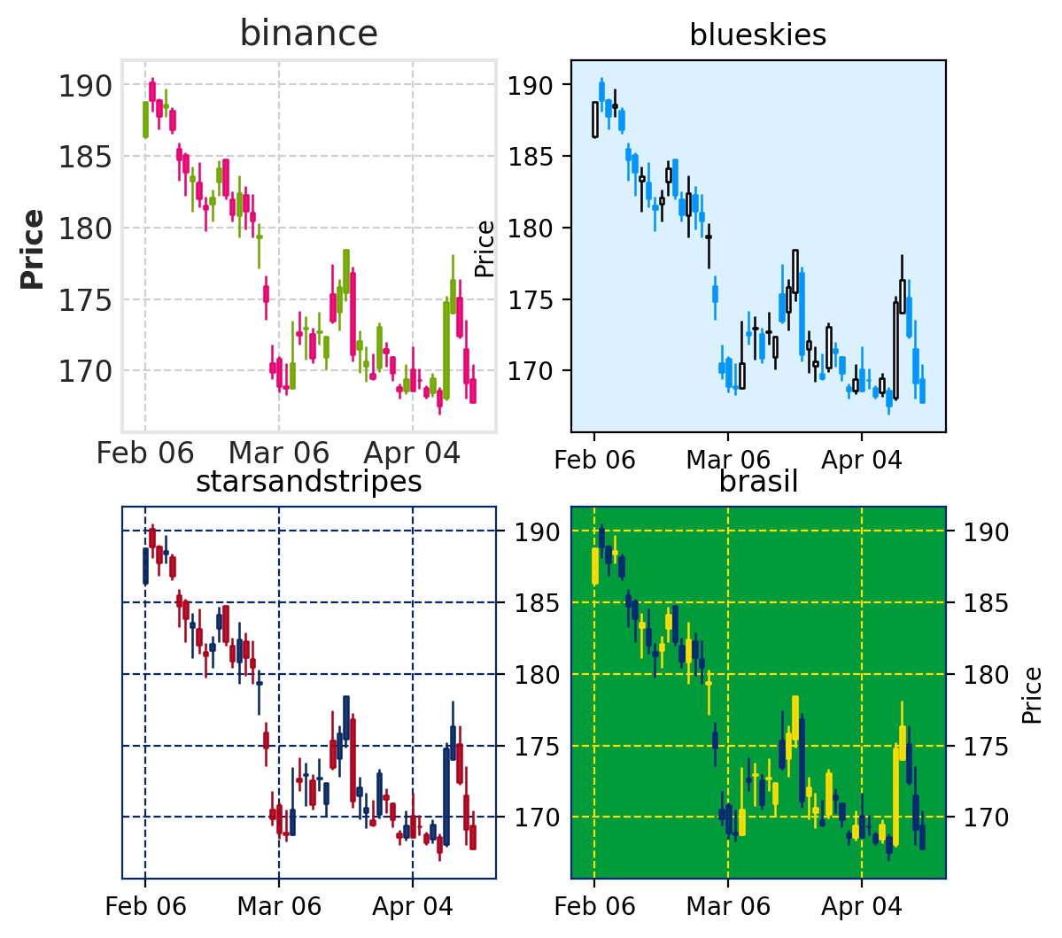
This plot uses the “yahoo” style. We can check the available style using the command mpf.available_styles(). Now let us look at a few other available styles below:
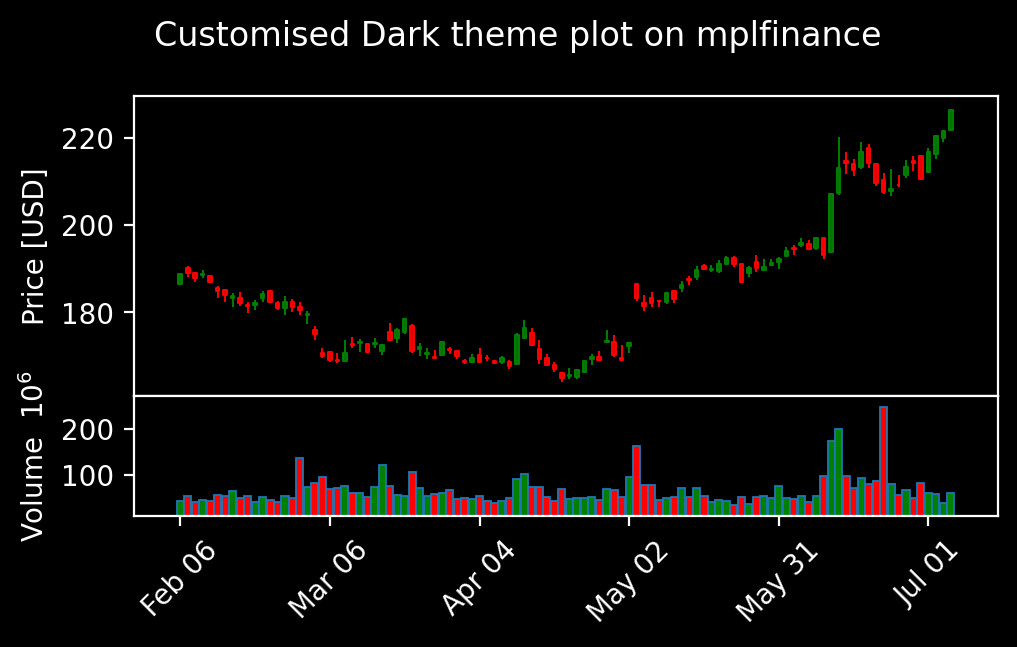
And now we will tweak and play with the candle colors and background. First we will set the base mplstyle to dark_background (for reference, check here). Then we will set marketcolors for the chart:
Code
mc = mpf.make_marketcolors(up="g",down="r",inherit=True)s = mpf.make_mpf_style(base_mpl_style="dark_background",marketcolors=mc)mpf.plot(data, type="candle", volume=True, style=s, figsize=(6,3),title="Customised Dark theme plot on mplfinance", ylabel="Price [USD]")
For looking further stye changes using mplfinance, one might check their example notebook
We will move ahead and try hands on some interactive plotting libraries.
Plotly
Plotly is perhaps the most used interactive visualization library in python. It offers a great deal of customization. With Plotly, we will make two types of charts, OHLC and Volume plotted together in first one, separate in the next.
Plotly as well offers multiple themes and customizations, for now will use the dark theme and just change the colors of volume bars for the first plot.
Bokeh is an interactive visualization library for modern web browsers. It provides elegant, concise construction of versatile graphics, and affords high-performance interactivity over large or streaming datasets. Bokeh can help anyone who would like to quickly and easily make interactive plots, dashboards, and data applications.
Bokeh additionally has great documentation and user guide. Now let’s look at a candlestick chart created using Bokeh:
That really looks good. If you are going through the code here, you can see how simple it would be to change the colors of bars. One can further add tooltips that will display the OHLC data on hovering over the candles.
One might further look at libraries like Altair, ggplot. One great library that I just found while writing this post is Holoviews